Branding Strategy for Unsigned
The visual identity and brand personality of Unsigned was designed to be bold, mirroring the company’s aim to serve as a disruptive force against the rampant exploitation in the record industry.
Our primary logo [Figs. 1-2] is a combination mark that features the ‘U’ of Unsigned in a glitch effect font which runs diagonally, meant to communicate our hard stance against the manner in which artists are forced to sign contracts that often work directly against their interests and future sales. The diagonal glitch effect communicates disruption without deterring engagement.
Two other forms of the logo have been adopted for different purposes, yet retain the central elements of the glitch font, allowing us to present a dynamic and fresh image while retaining a strong central brand identity. The first of these is a pictorial mark that presents the glitch effect “U,” but drops the wordmark underneath, and can be easily implemented as a favicon, minimalistic profile photo, or any other small accompaniment [Figs. 3-4].
-
The third iteration of the logo is a wordmark of the name of the company that incorporates the glitch effect “U” into the word itself [Figs. 5-6].
-
-33-

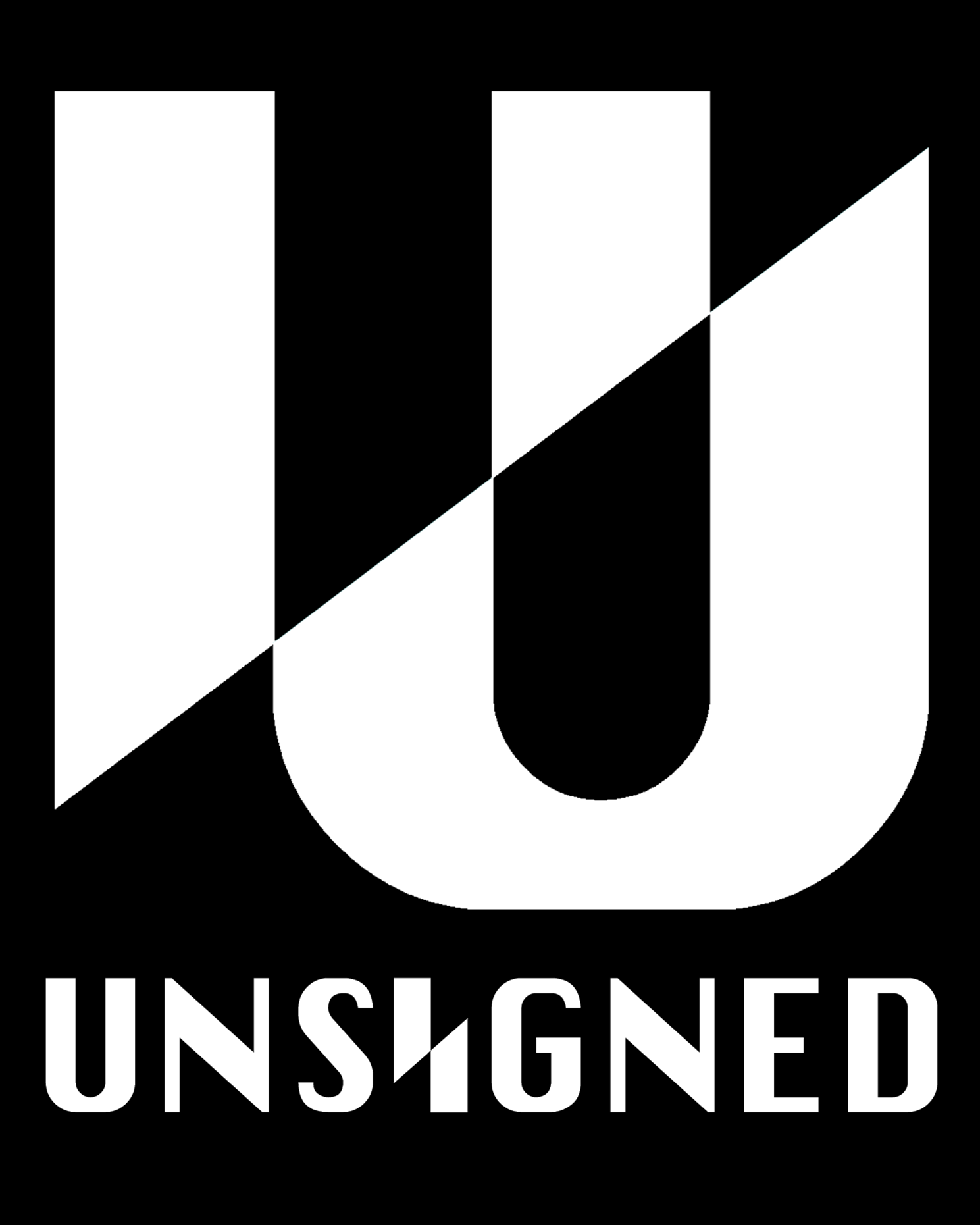
[Figs. 1-2]:
Primary Combination Logo (both color inversions)


[Figs. 3-4]
Pictorial Logo Mark (both color inversions)
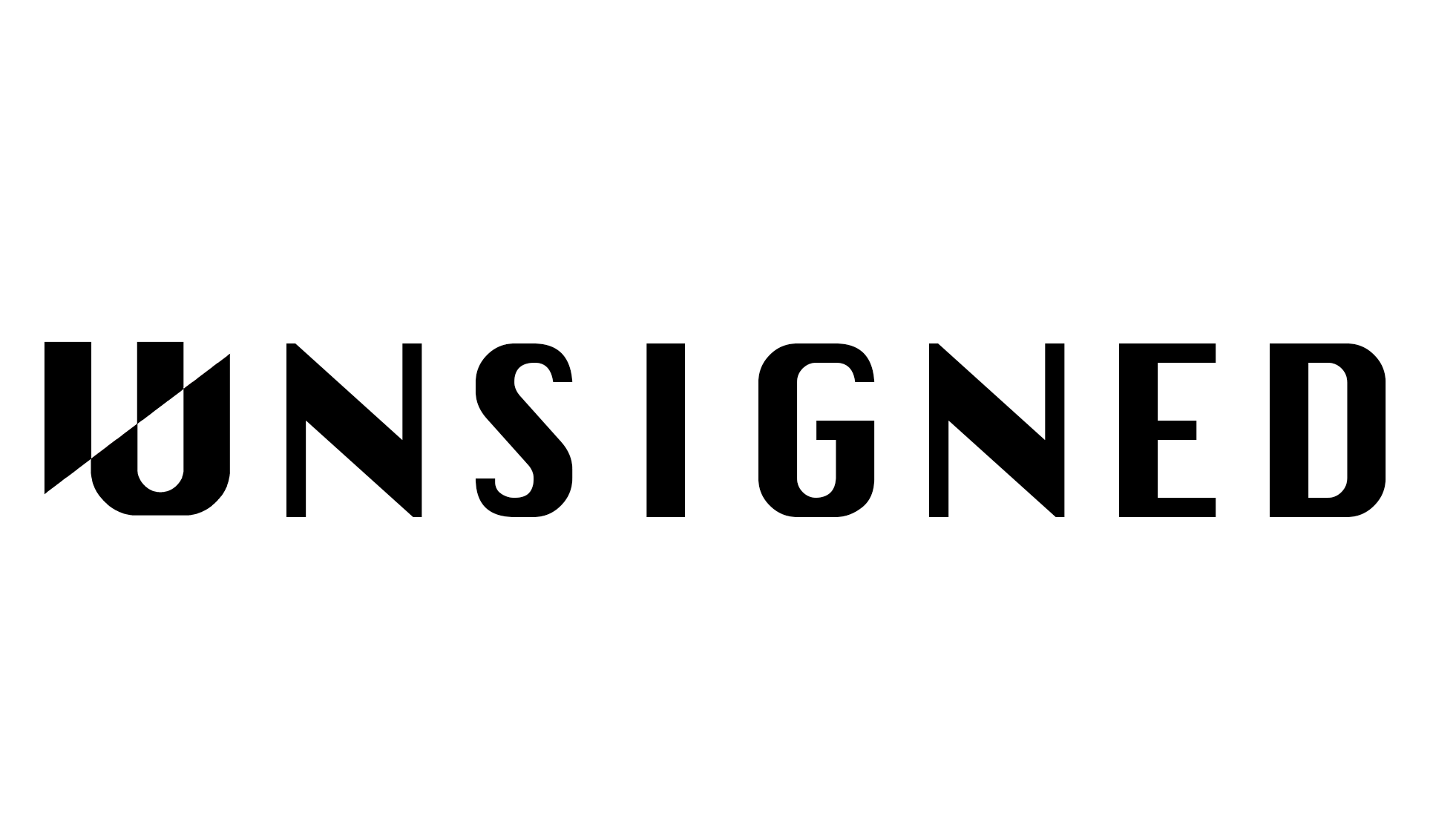

[Figs. 5-6]:
Wordmark Logo (both color inversions)